Atlassian Jira Logo: Meaning, Usage, and Brand Guidelines
Unsure which Jira logo is current or how to use it? Learn its meaning, versions, and brand guidelines. Read now to use the Atlassian Jira logo correctly.
Finding the Atlassian Jira logo should be simple, yet old screenshots, unofficial downloads, and product icons can make it hard to identify the right version. Using the wrong mark can confuse readers, weaken your design, or imply an endorsement you never intended.
That uncertainty matters when you’re preparing a presentation, product comparison, tutorial, or integration page. A logo that looks nearly right may still be outdated, altered, or used in a way that misrepresents your relationship with Atlassian.
But here's the truth: you can identify Jira’s recognizable mark and use it more confidently by understanding its design, checking the context, and respecting brand rules. Here’s a practical guide to what the logo communicates, where it belongs, and what to avoid.
What the Atlassian Jira Logo Is and What It Represents
The Atlassian Jira logo is Jira’s product identity: a blue, angular symbol paired with the Jira wordmark in many branded placements. The symbol is built from curved, stacked shapes that create a forward-moving, upward impression.
Jira is part of Atlassian’s product family, so its identity needs to distinguish Jira while still fitting alongside other Atlassian products. The mark’s simple geometry helps it remain recognizable at small sizes, such as a browser tab or app icon.
Here’s why: a logo is more than a decorative label. In a product interface, it helps people recognize the tool; in an article or presentation, it signals which product you’re discussing.
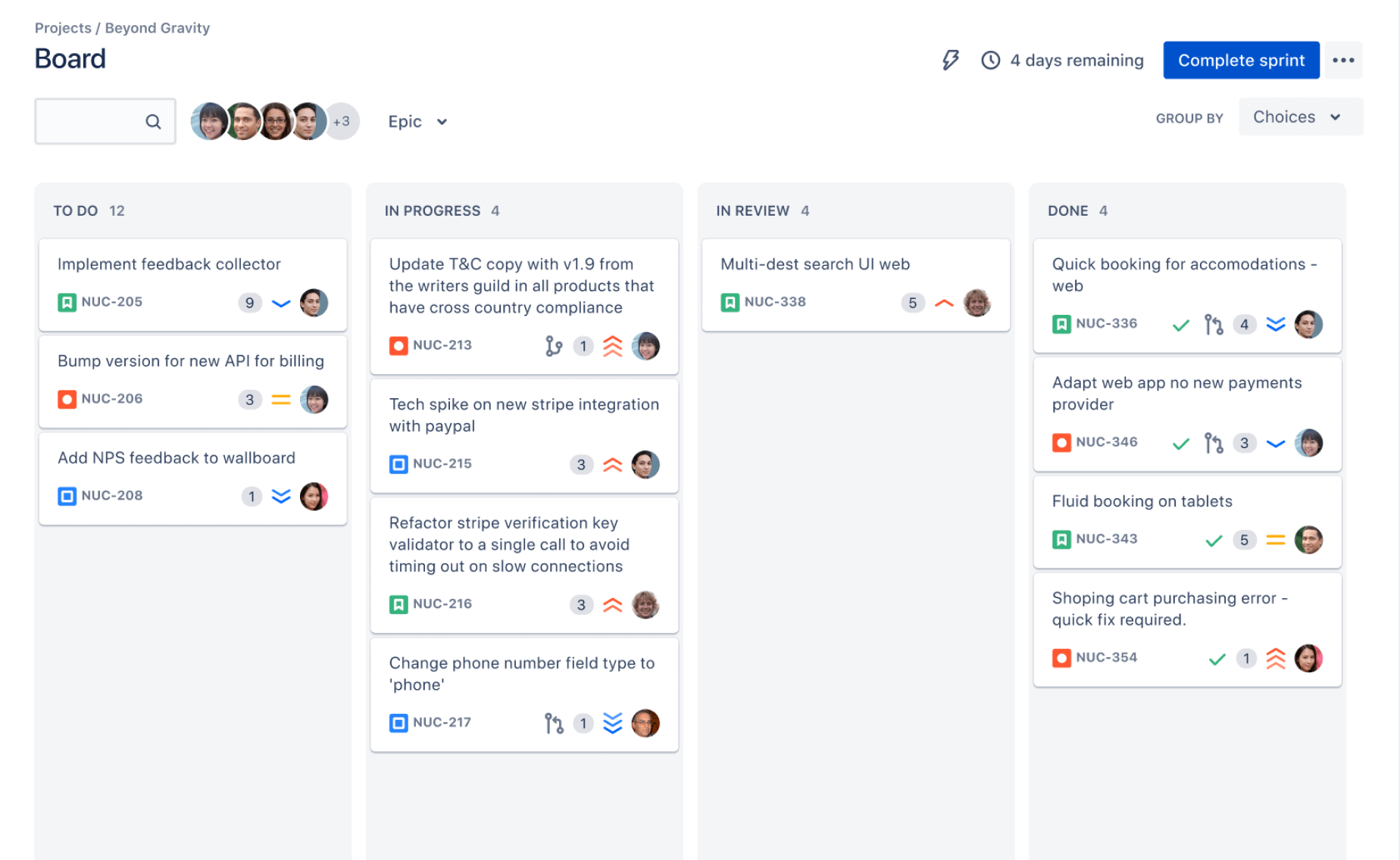
Jira’s symbol and wordmark
The symbol can appear by itself where space is limited, while the wordmark makes the product name explicit. You may see the two together in product pages, presentations, and promotional materials.
Don’t assume every blue icon is the Jira logo. Atlassian uses a broader visual identity across its products, and app icons can look different from a full logo lockup.
How to Recognize the Logo and Understand Its Design
Look for the combination of a bright blue, upward-pointing geometric mark and the “Jira” wordmark. The exact presentation can vary across product interfaces and brand materials, so context matters as much as color.
For example, a small Jira icon in a browser tab may show only the symbol. A marketing page may pair it with the product name and other Atlassian branding.
Why the design feels recognizable
The compact shape gives the symbol a clear silhouette, while the blue color connects it with Jira’s familiar visual identity. Its upward movement can suggest progress, momentum, or work moving through stages.
Those impressions are visual interpretations, rather than a guarantee of a single official meaning. The most useful practical point is recognition: people can distinguish the product mark from ordinary text or generic interface symbols.
Where the Jira Logo Is Commonly Used
You’ll commonly see Jira’s logo in the product interface, app listings, Atlassian product pages, training materials, and software comparisons. It can also appear in a tutorial when the content clearly explains Jira features.
Consider a project management article comparing Jira with another platform. A properly displayed logo can help readers identify the product being discussed without suggesting that Atlassian endorsed the article.
Match the logo format to the placement
Use a symbol-only version when space is tight and the product is already clear. Choose a wordmark or combined lockup when readers may not recognize the icon on its own.
For a presentation slide, leave enough clear space around the mark and keep it large enough to read. In a compact navigation area, a recognizable icon may be more practical than the full wordmark.
Practical Brand Guidelines for Using the Logo
Start with an approved Atlassian brand asset, then preserve its original proportions, color, and shape. Check Atlassian’s current brand guidance before publishing, especially when a project requires formal approval.
- Keep the proportions intact. Resize the logo evenly instead of stretching it wider or taller.
- Preserve the artwork. Don’t redraw the symbol, rearrange its parts, or add effects that change its appearance.
- Choose a clear background. Make sure the symbol and wordmark stand out against the surrounding design.
- Leave breathing room. Avoid crowding the mark with text, borders, or unrelated graphics.
- Use it in the right context. Explain Jira accurately, and don’t imply a partnership or endorsement that doesn’t exist.
- Check for current guidance. Atlassian may update brand assets and usage requirements over time.
Let me explain: a logo can remain visually recognizable and still be used incorrectly. For example, placing it beside “official partner” without authorization could mislead readers, even if the artwork itself is untouched.
A Project Management Platform Option: ONES.com
If you’re researching Jira’s identity while comparing project platforms, ONES.com offers a separate option for project and knowledge management. ONES Project is its project management product and a Jira alternative; ONES Wiki provides knowledge management as a Confluence alternative. They’re sold separately.
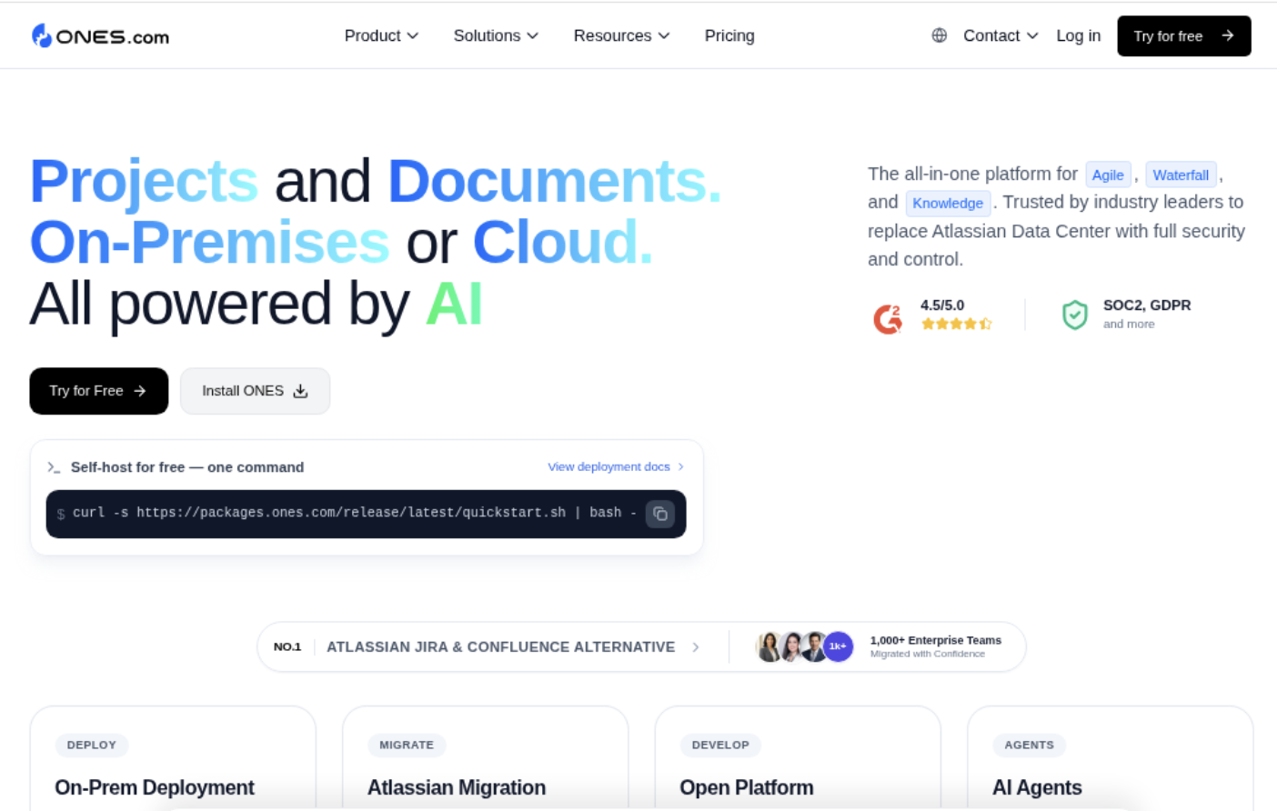
Value proposition: ONES.com brings project and knowledge management together under one platform, powered by ONES Assistant. Teams can choose a deployment model and manage work without relying on a large collection of add-ons.
Core capabilities
- Need Jira-compatible workflows? ONES Project supports Jira-compatible workflows, helping teams adapt familiar processes.
- Need work visibility? Built-in reporting gives teams a way to track progress without assembling separate reporting add-ons.
- Changing processes? Custom workflows and fields let teams reflect their own review steps and project details.
- Managing iterative delivery? Sprint management supports teams that plan and review work in cycles.
- Repeating routine tasks? Automation can reduce manual steps in common project workflows.
- Reducing plugin dependence? Native capabilities can cover more routine needs within the platform.
- Working in restricted environments? Cloud, On-Premise, Private Cloud, and Air-gapped deployments give teams deployment choices.
- Seeking consistency across deployments? The cloud and self-hosted versions have full feature parity, so deployment choice needn’t dictate feature access.
Application scenarios
A software team moving from Jira can assess ONES Project against its existing workflows, sprint routines, and reporting needs. A 30-seat free plan provides room for a small team to try the platform.
A company with strict network requirements can consider an On-Premise, Private Cloud, or Air-gapped deployment. A team managing project work and internal guidance can use ONES Project and ONES Wiki as separate products within the broader platform.
Common Challenges When Using the Jira Logo
- Problem: You find several logo versions. Check Atlassian’s current brand guidance and choose the version intended for your placement.
- Problem: The mark looks blurry. Use a suitable high-resolution asset and avoid enlarging a tiny icon beyond its clear display size.
- Problem: The logo disappears into its background. Select a version and background combination that gives the artwork enough contrast.
- Problem: Readers assume you’re affiliated with Atlassian. Add clear wording that describes the content as independent, and avoid partnership claims unless they’re authorized.
- Problem: A tutorial shows an outdated interface or mark. Review screenshots and branding before publication, then update visuals that no longer match the product.
You might be wondering: can you use the logo in an independent review? Often, editorial discussion may need to identify the product being reviewed, but the exact rules depend on Atlassian’s current requirements and your use.
When the use has legal or commercial consequences, check the applicable brand terms and seek qualified legal advice. A general design guide can’t determine your rights in every situation.
FAQs About the Atlassian Jira Logo
What does the Jira logo look like?
The Jira identity commonly features a bright blue, angular symbol with a Jira wordmark. In compact settings, such as an app icon or browser tab, you may see the symbol alone. The precise treatment can vary by placement, so compare the image with Atlassian’s current brand materials before using it in published content.
Can I use the Jira logo in an article or presentation?
You may need to show the logo to identify Jira in an informative article, tutorial, or presentation. Use an approved asset, keep it unchanged, and avoid suggesting Atlassian sponsors or endorses your work. Review current Atlassian brand guidance for your particular use, especially for advertising, commercial campaigns, or partner materials.
Can I recolor or modify the Jira logo?
Avoid changing the logo’s color, proportions, shape, or arrangement unless Atlassian’s current guidance specifically permits the treatment. Alterations can make the mark harder to recognize and may conflict with brand requirements. If a design needs a different treatment, look for an approved version that works with the intended background rather than editing the artwork yourself.
Is the Jira logo the same as the Atlassian logo?
No. Jira is an Atlassian product, and it has its own product identity. The Atlassian logo represents the broader company, while Jira’s logo identifies the Jira product. They may appear together in some brand contexts, but one shouldn’t be substituted for the other when a design needs to identify a specific product.
Where can I check the latest logo guidance?
Check Atlassian’s official brand and product materials for the latest logo assets and usage instructions. Brand treatments may change, and third-party image collections can retain older versions. Before publishing, confirm that the artwork, background, and surrounding claims suit your intended use, particularly when the logo appears in a commercial setting.
Conclusion
The Jira logo is a recognizable product mark, typically shown as a blue geometric symbol with a Jira wordmark. Identify the right version, preserve its proportions and appearance, and use it in a way that doesn’t imply an unauthorized relationship.
When you’re evaluating Jira alongside other project platforms, also compare workflows, reporting, deployment options, and knowledge management needs. A careful logo choice avoids confusion; a careful platform comparison helps you choose an environment that suits your team.