Jira Dashboards: A Practical Guide to Clearer Team Insights
Need clearer team insights? Learn how jira dashboards reveal progress, risk, workload, and team health—click to discover a better approach.
When project information is scattered across boards, filters, and sprint reports, important signals can disappear quickly. You may know your team is busy, yet still struggle to explain why delivery is slowing.
That uncertainty creates longer status meetings, late surprises, and decisions driven by instinct. A crowded dashboard can make the problem worse when every chart competes for attention.
But here's the truth: a useful Jira dashboard does not show everything. It shows the few measures that help you understand progress, risk, workload, and team health. This guide explains how Jira dashboards work, what to include, how to avoid common mistakes, and how another project management approach can give your team clearer visibility.
What Jira Dashboards Are and How They Work
Jira dashboards are customizable visual workspaces that display project metrics, issue lists, charts, and activity through configurable gadgets. They help you monitor progress, identify risks, and tailor visibility for different teams or roles.
A dashboard usually combines several views into one screen. For example, a product manager might see sprint progress, overdue issues, priority distribution, and unresolved bugs together.
Here's why: Jira dashboards turn activity into a quick operational picture. Instead of opening several project views, you can review the most important signals in one place.
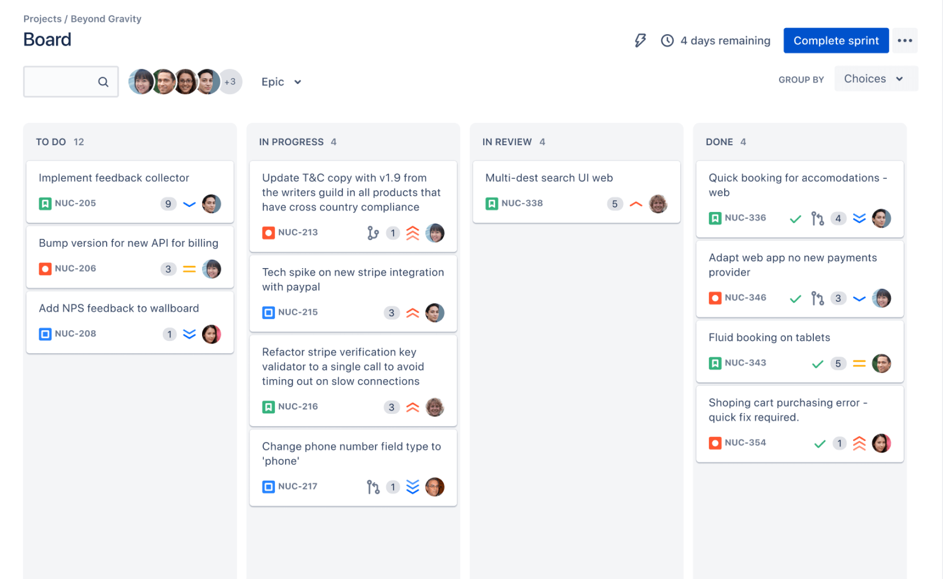
Key dashboard components
Jira dashboards use gadgets to present specific information. Each gadget answers a different question about your work.
- Filter Results: Which issues need attention right now?
- Created vs. Resolved Chart: Are incoming issues outpacing completed work?
- Pie Chart: How are issues distributed by priority, status, assignee, or type?
- Assigned to Me: What work requires your immediate attention?
- Activity Stream: What changed recently across a project?
- Average Age Chart: How long do unresolved issues remain open?
- Two-Dimensional Chart: How do two categories interact, such as priority and status?
- Sprint-related gadgets: How is the current sprint progressing toward completion?
How a dashboard differs from a board
A Jira board supports active work management. You move issues through workflow stages, assign tasks, and coordinate daily execution.
A dashboard supports monitoring and communication. It helps you understand patterns across issues, sprints, teams, or projects.
For example, a board may show that five tasks remain in progress. A dashboard can reveal that most of those tasks are high priority and have exceeded their expected age.
How to Build a Jira Dashboard That Helps You Decide
The best dashboard starts with a decision, not a gadget. Ask what you need to notice early, then select the smallest useful set of views.
- Define the audience. Decide whether the dashboard serves executives, project managers, developers, support specialists, or the entire team. Each group needs different detail.
- Choose one primary purpose. A sprint dashboard might focus on delivery risk. A service dashboard might focus on response times and unresolved requests.
- List the decisions the dashboard should support. Examples include reallocating capacity, escalating blocked work, adjusting sprint scope, or reviewing quality trends.
- Create focused filters. Use clear JQL conditions for status, project, priority, assignee, sprint, label, or due date. Keep each filter narrow enough to produce a meaningful result.
- Select complementary gadgets. Combine one summary chart with detailed issue lists. A chart can reveal a pattern, while a list helps you act on it.
- Arrange the layout by urgency. Place risks and blocked work near the top. Put trend views and background metrics lower on the page.
- Check the time range. A seven-day view may help with daily delivery. A ninety-day view can reveal longer-term changes.
- Test the dashboard with its intended audience. Ask someone to identify the top risk and next action within one minute. If they cannot, simplify the layout.
- Review it regularly. Remove gadgets that no longer support decisions. Update filters when workflows, teams, or priorities change.
The best part? You rarely need a crowded screen. A team dashboard with four precise gadgets often creates more clarity than one with fifteen competing charts.
Dashboard Types for Different Team Needs
A dashboard should reflect the work it helps you manage. The right design for a software team may confuse a support team or an executive audience.
Executive project overview
Leadership usually needs a concise view of progress, risk, and delivery confidence. Useful elements include milestone status, high-priority work, overdue items, and unresolved blockers.
For example, a release dashboard might show six completed milestones, two delayed items, and three critical defects. That gives leaders a clear starting point for discussion.
Project manager dashboard
Project managers often need more operational detail. Include work by status, overdue tasks, blocked issues, sprint progress, and activity across contributors.
A two-dimensional chart can reveal whether delays are concentrated in one workstream. A filtered issue list can then show the exact tasks requiring intervention.
Development team dashboard
Developers benefit from views that support flow and technical quality. Consider sprint progress, unassigned issues, code-related defects, aging work, and items waiting for review.
Keep the focus practical. A long list of broad metrics can distract the team from the next action.
Support and service dashboard
Support teams may track incoming requests, response targets, unresolved incidents, priority levels, and age distribution.
For instance, a chart showing many low-priority requests can look reassuring until an age report reveals that several have remained open for months.
Cross-project portfolio dashboard
A portfolio view can compare project health, upcoming milestones, open risks, and capacity concerns. Use consistent labels and statuses across projects where possible.
Without consistent definitions, comparing projects becomes misleading. One team’s “at risk” status may mean something very different from another team’s.
What to Track for Clearer Team Insights
Metrics become useful when they connect to an action. Before adding a chart, decide what you will do when the result changes.
Delivery progress
Track completed work, remaining work, sprint progress, and milestone movement. These measures help you see whether delivery is moving toward a target.
Velocity can provide context, but it should not become a performance score. A team may complete fewer points while handling complex defects or reducing technical risk.
Work in progress
Work in progress shows how much unfinished activity is competing for attention. A growing number may indicate too many parallel priorities or a bottleneck in review.
Suppose a team has twelve items in progress and only two completed this week. The dashboard should prompt a conversation about focus, not encourage more task assignments.
Issue aging
Aging measures show how long work remains open. They can expose neglected defects, unclear ownership, or approval delays.
Use age thresholds that fit your workflow. A two-day delay may matter for a production incident but not for a long-term research task.
Quality and defects
Track open defects, severity, resolution time, and defect trends. Pair these measures with delivery views to understand trade-offs.
A falling defect count may indicate better quality. It may also mean fewer issues are being reported, so investigate the surrounding context.
Team workload
Assignee-based views can reveal uneven distribution. However, avoid treating assigned issue counts as precise workload measurements.
One complex task may require more effort than ten small tasks. Use assignment views as conversation starters, then consider complexity, dependencies, and availability.

Flow and bottlenecks
Compare work entering each workflow stage with work leaving it. If review items accumulate while development remains active, review capacity may be limiting delivery.
Let me explain: a bottleneck is often easier to spot through movement patterns than through a single status count.
Common Jira Dashboard Design Mistakes
A dashboard can be technically accurate and still fail in practice. Most problems come from unclear goals, stale settings, or too much visual noise.
Showing every available metric
More charts do not automatically create more insight. A crowded layout increases scanning time and makes important signals harder to find.
Start with three questions: What is changing? What is at risk? What action should happen next?
Using vague or unstable filters
A filter that depends on inconsistent labels may produce unreliable results. For example, “urgent,” “Urgent,” and “critical-now” can split the same priority into separate groups.
Define naming rules and review saved filters when workflows change. A dashboard is only as reliable as the conditions behind its views.
Ignoring permissions
Some gadgets may show different results depending on project permissions. Two people viewing the same dashboard may see different issue counts.
Check access settings before using a dashboard for formal reporting. Explain any visibility limits clearly.
Confusing activity with progress
A busy activity stream does not prove that meaningful work is advancing. Frequent comments and status changes may reflect coordination, rework, or confusion.
Pair activity with completion, aging, or milestone measures to create a more balanced picture.
Failing to assign ownership
A dashboard should have someone responsible for maintaining its filters, definitions, and layout. Without ownership, inaccurate views can remain visible for months.
Schedule a short monthly review. Remove obsolete gadgets and confirm that key measures still support current decisions.
Making Dashboard Reviews Part of Team Operations
A dashboard becomes valuable when your team uses it during a repeatable routine. Viewing it once during setup will not change decision-making.
Use a short weekly review
Set aside ten minutes to identify the largest change, oldest unresolved item, and most serious risk. End with an owner and next action for each concern.
This rhythm prevents dashboard reviews from becoming long reporting sessions. The goal is a decision, not a tour of every chart.
Compare trends instead of isolated snapshots
A single count can mislead you. Compare the current period with the previous sprint, month, or release cycle.
For example, twenty open defects may be acceptable if the count dropped from fifty. It may be worrying if the count rose from eight.
Connect metrics to conversations
Use the dashboard to ask better questions. If work is aging, ask where it waits. If priorities are concentrated, ask whether the team has enough capacity.
You might be wondering: should every team member see the same dashboard? Usually, a shared overview helps alignment, while role-specific views support detailed action.
Keep definitions visible
Explain terms such as “blocked,” “overdue,” “completed,” and “at risk.” A short description prevents different interpretations during planning or review meetings.
For example, define “overdue” as an issue past its target date, rather than an issue that has remained open longer than expected.
Jira Dashboard Alternatives: ONES.com

Value Proposition
ONES.com combines project management and knowledge management in one platform, with AI support through ONES Assistant. ONES Project is a Jira alternative sold separately, while ONES Wiki provides a knowledge base alternative to Confluence.
For teams that want project status, workflows, reporting, and shared knowledge to stay connected, ONES.com can reduce the need to coordinate information across multiple tools.
Core Capabilities
1. Scattered project views → unified project management
When progress is spread across several project areas, ONES Project brings planning, issue tracking, sprint management, and reporting into one workspace. You get a clearer path from planned work to completed work.
2. Complex Jira migration concerns → Jira-compatible workflows
If your team already relies on familiar Jira-style processes, compatible workflows can reduce the learning curve. Existing habits around issue tracking and sprint execution can carry over more naturally.
3. Limited visibility → built-in reporting
When teams depend on manual status updates, built-in reporting helps present progress, workload, and delivery patterns more consistently. That gives managers a stronger basis for review conversations.
4. Rigid processes → custom workflows and fields
Different teams often need different approval steps, issue categories, and ownership fields. Custom workflows and fields let you reflect those operating rules without forcing every project into one pattern.
5. Too many extensions → reduced plugin dependence
When essential functions require numerous add-ons, administration becomes harder. Native capabilities for workflows, automation, sprint management, and reporting can reduce the number of separate extensions you need to maintain.
6. Deployment restrictions → flexible hosting options
Some organizations cannot place project information in a public cloud environment. ONES.com supports Cloud, On-Premise, Private Cloud, and Air-gapped deployments, helping teams match hosting with security requirements.
7. Feature gaps between hosting models → feature parity
Teams may hesitate to self-host when they expect fewer capabilities. ONES.com provides full feature parity between its cloud and self-hosted versions, so deployment choice does not require giving up core functionality.
8. Separate knowledge and delivery work → connected project and knowledge management
When decisions and project activity become disconnected, ONES.com links project management with knowledge management. Teams can keep working context closer to the tasks and processes it explains.
Application Scenarios
Software release team: A development group can use ONES Project for sprint planning, custom workflows, automation, and reporting. Release information can stay connected with related knowledge in ONES Wiki.
Restricted environment: An organization with strict network controls can select an On-Premise, Private Cloud, or Air-gapped deployment. The team retains core project capabilities without relying on a public cloud setup.
Growing project organization: A company with up to 30 seats can begin with the free plan, establish common workflows, and expand its operating model as collaboration becomes more structured.
Common Challenges and Practical Solutions
Challenge: The dashboard is too crowded
Solution: Remove any gadget that does not support a recurring decision. Keep one overview, one risk view, and one actionable issue list before adding more.
Challenge: Metrics create arguments
Solution: Define each metric in plain language. Agree on status meanings, time ranges, and ownership before using the numbers in reviews.
Challenge: Counts look correct but feel misleading
Solution: Add context through trends, age, priority, or workload. A count alone rarely explains why a project is changing.
Challenge: Filters stop working after workflow changes
Solution: Assign an owner to review filters after workflow edits, project launches, and major process changes. Include dashboard checks in operational maintenance.
Challenge: Teams watch dashboards without taking action
Solution: End every review with a named owner, a specific action, and a follow-up date. Visibility matters only when it improves the next decision.
FAQs
What should a Jira dashboard include?
Start with views that support a clear purpose. A practical project dashboard may include sprint progress, overdue issues, blocked work, priority distribution, and unresolved defects. Choose only the gadgets your team can interpret and act upon. If a chart creates discussion but never changes a decision, remove it or replace it with a more useful view.
How many gadgets should a dashboard have?
There is no universal number, but a focused dashboard often works best with four to eight gadgets. Put urgent risks and actionable issue lists near the top. Add trend charts only when they provide context that a current count cannot provide. Test the layout by asking someone to identify the largest risk quickly.
Can one Jira dashboard serve everyone?
A shared overview can help align a team, but different roles usually need different detail. Executives may need milestones and risks, while developers may need aging work and review queues. Use a common project view for alignment, then create role-specific dashboards for daily decisions.
Why do Jira dashboard numbers sometimes differ between people?
Permissions, project access, filter ownership, and changing issue conditions can affect what each person sees. Review the filter settings and access permissions when counts differ unexpectedly. Also check whether people are viewing the same time range, project scope, and status definitions.
Are Jira dashboards useful for agile teams?
Yes. Agile teams can use them to monitor sprint progress, work in progress, blocked issues, cycle patterns, and defect trends. The dashboard should support conversations about flow and delivery rather than become a scorecard for individuals. Use metrics to identify constraints and improve the process.
Conclusion
Clear Jira dashboards help you see progress, risk, workload, and quality without opening every project view. The strongest dashboards begin with a decision, use focused filters, and connect each metric to an action.
But here's the truth: a dashboard cannot repair unclear workflows or inconsistent definitions by itself. Review the layout regularly, explain what each measure means, and give someone responsibility for keeping it useful.
If your team needs a Jira alternative with project management, reporting, custom workflows, automation, flexible deployment, and connected knowledge management, ONES.com is worth evaluating. The goal remains simple: turn project activity into clearer decisions and fewer delivery surprises.