Jira Logo Explained: Meaning, Design, and Brand Usage Guide
Wondering what the Jira logo means and how to use it correctly? Explore its design, symbolism, colors, and brand guidelines. Read now!
A logo can look simple while carrying a surprising amount of meaning. If you use the Jira logo in a presentation, product page, training guide, or community post, small mistakes can make your work look careless.
The wrong color, stretched proportions, crowded spacing, or outdated artwork can weaken brand recognition. Even a well-intentioned redesign may create confusion about whether your content is officially connected to Atlassian.
But here's the truth: you do not need to be a brand designer to use the Jira logo correctly. You need to understand its visual structure, what it communicates, and which usage habits to avoid. This guide explains the Jira logo in plain English, including its meaning, design principles, variations, placement rules, and practical brand examples.
What the Jira Logo Means and How Its Design Works
The Jira logo is the visual identity for Jira, Atlassian’s project and issue management product. It combines a distinctive blue symbol with a wordmark to communicate movement, structure, collaboration, and digital work management.
The symbol is designed around curved and angled forms that create a compact, recognizable mark. Many viewers interpret the shape as connected movement or an abstract “J,” which fits Jira’s role in tracking work through statuses, teams, and delivery stages.
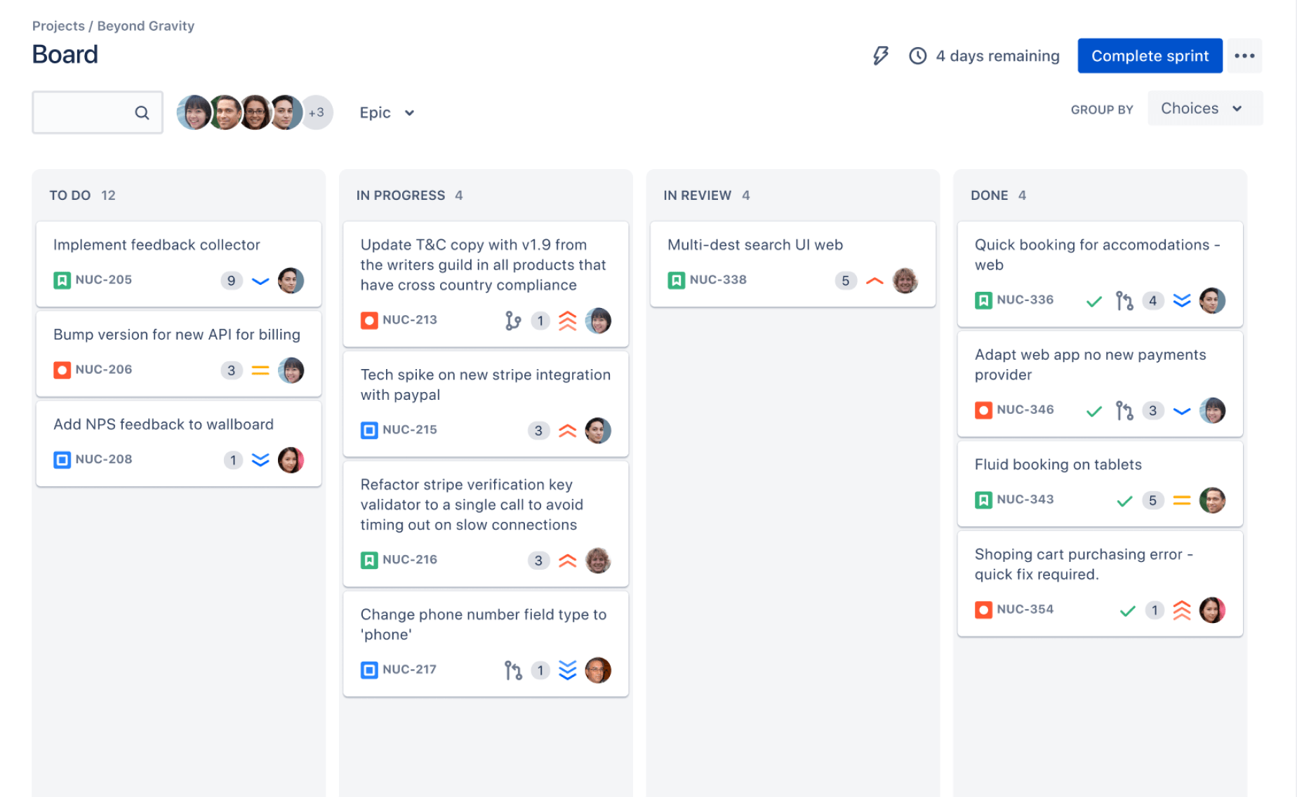
The main visual elements
- Symbol: The compact icon gives Jira a recognizable shape that can work at smaller sizes.
- Wordmark: The “Jira” name makes the brand clear when the icon appears beside other software products.
- Blue color: The color creates a friendly, modern, and dependable impression in digital interfaces.
- Rounded geometry: Curved edges soften the technical subject and make the product feel approachable.
- Simple silhouette: The uncomplicated shape remains easier to identify in navigation bars, app icons, and product listings.
Why the design fits Jira
Jira helps teams move work through a visible process. A task may begin as an idea, become an assigned item, enter development, pass through review, and reach completion.
The logo’s directional forms support that concept without showing a literal board, ticket, or workflow. This gives the identity flexibility across project management, software development, service management, and team planning contexts.
Here's why: strong software branding often uses a simple visual cue rather than an illustration packed with details. A compact symbol survives more situations, from a browser tab to a large event banner.
How the Jira Brand Identity Has Evolved
Jira’s visual identity has changed as Atlassian expanded the product beyond its early developer-focused reputation. The brand now needs to speak to product managers, designers, operations teams, support groups, and business leaders.
Earlier Jira branding was closely associated with software development and issue tracking. Over time, the identity became cleaner and more flexible, helping the product appear suitable for broader collaboration and planning work.
From technical tool to broader work platform
A narrow product identity might focus heavily on bugs, code, or engineering tickets. A broader identity must also support roadmaps, approvals, customer requests, incident response, and cross-functional planning.
The modern visual direction uses simplicity to support that wider audience. The logo does not need to explain every product function. Instead, it acts as a stable identifier while the surrounding interface explains the specific use case.
Why logo updates happen
Companies usually update a logo for several practical reasons:
- The product has gained new audiences.
- The identity needs to work across more digital surfaces.
- The company wants a consistent visual system across related products.
- Older artwork may not scale clearly on high-resolution screens.
- The brand needs stronger visual separation from competitors.
A redesign does not necessarily mean the previous logo was unsuccessful. It may show that the product, audience, or brand architecture has developed.
Jira Logo Variations You May Encounter
You may see several Jira logo treatments in everyday use. They can represent the same brand while serving different layout requirements.
Symbol and wordmark together
This is usually the clearest treatment when people may not immediately recognize the symbol. The icon identifies the brand visually, while the wordmark removes ambiguity.
Use this version in product comparisons, partner pages, training materials, and introductory presentations. For example, a slide titled “Jira project workflow” benefits from showing the complete identity near the first mention.
Symbol-only treatment
The symbol-only version works when the surrounding context already identifies Jira. Common placements include application menus, compact cards, browser-style navigation, and small promotional spaces.
It may create confusion when shown beside several unfamiliar product icons. In that situation, add the wordmark or write the product name nearby.
Light and dark background versions
A logo may need a dark-background or light-background treatment to preserve contrast. The correct choice depends on the surrounding color, screen conditions, and available brand guidance.
Do not recreate a version by changing the hue manually. A visually similar blue may still produce inconsistent branding across pages.
Monochrome treatments
Some layouts require a single-color mark, such as a black-and-white print piece or a restricted-color interface. A monochrome version can work when the full-color treatment would lose clarity.
Use a prepared monochrome treatment whenever possible. Converting the logo with an editing tool can create poor contrast or alter the visual weight of the symbol.
Jira Logo Brand Usage Rules
Good logo usage protects recognition. The easiest approach is to preserve the artwork exactly and give it enough room to remain clear.
Keep the proportions intact
Never stretch the logo horizontally or vertically. A stretched symbol can make the curves look distorted, while a compressed wordmark may become difficult to read.
If you need a wider or narrower layout, resize the complete mark proportionally. Most design and presentation tools let you lock the aspect ratio before dragging a corner.
Protect clear space
Clear space is the empty area around a logo. It prevents headings, photographs, borders, icons, and other brand marks from competing with the identity.
For example, avoid placing the Jira logo directly against a paragraph or touching the edge of a card. A small amount of breathing room can make the mark look substantially more professional.
Use enough contrast
A logo should remain easy to distinguish from its background. A blue mark on a similar blue surface may technically appear, yet still lose visual strength.
Check the logo on the actual screen or printed surface where people will see it. A treatment that looks acceptable on a bright monitor may appear weak in a dim presentation room.
Respect the surrounding brands
When Jira appears beside Atlassian, partner, or customer branding, keep the marks visually balanced. Avoid making one logo appear to endorse another unless the relationship is clearly established.
Equal height does not always create equal visual weight. A wide wordmark and a compact icon may need slightly different sizing to look balanced.
Follow current official guidance
Brand rules can change as products and corporate identities evolve. For an official campaign, partnership page, or public announcement, check the latest Atlassian brand guidance before publishing.
This matters especially when you need exact color values, minimum sizes, approved artwork, trademark wording, or co-branding instructions.
Common Jira Logo Mistakes and Why They Matter
Most logo problems come from convenience. Someone grabs an image from a search result, adjusts it quickly, and moves on. The result may look acceptable at first glance but fail under closer review.
Using a low-quality image
A blurry logo becomes especially noticeable when enlarged. Jagged edges and fuzzy lettering make a polished presentation appear unfinished.
Choose a high-resolution or vector version suitable for the final use. A small web image may work in a compact interface but fail on a poster or conference screen.
Changing the colors
Adding gradients, shadows, neon effects, or personal brand colors can make the logo look like a different product. Creative treatments may also suggest an unofficial relationship.
If you need the logo to fit a visual theme, adjust the surrounding design instead. Use the approved mark and build the color palette around it.
Adding effects
Drop shadows, outlines, bevels, glows, and reflections can reduce clarity. They also make the identity harder to recognize across different layouts.
For example, a heavy white outline may help a logo stand out on a photograph, but it can look inconsistent when the same mark appears on a clean product page.
Combining the logo with new slogans
Placing a slogan directly inside or beside the Jira logo can imply an official campaign. It may also make the mark harder to read.
Keep promotional copy separate. A heading above the logo usually gives you more control and preserves the identity’s proportions.
Using an old variation without checking context
Older logos may still appear in archived presentations, tutorials, or community posts. That does not mean they are the best choice for new public work.
When the material represents a current partnership or product relationship, use the latest approved treatment available for that purpose.
Practical Examples of Correct Placement
The right treatment depends on the communication goal. A logo used to identify a product is different from a logo used to show a technology connection.
Presentation cover
Place the complete Jira logo in a corner with sufficient space around it. Keep the presentation title separate so the product identity does not compete with the main message.
For a slide about sprint planning, you might use the Jira logo near the subtitle while showing the workflow inside the main visual area.
Product comparison page
Use the symbol and wordmark when comparing Jira with other project management platforms. Consistent logo sizing helps readers scan the comparison quickly.
Align the marks within equal-width cards, then use plain text for capabilities, pricing notes, or workflow differences.
Training material
Introduce the complete logo on the first page. Later pages can use the symbol alone if the training context remains clear.
This approach avoids repeating a large wordmark on every page while preserving recognition throughout the lesson.
Partner or integration page
Show the Jira logo only when the relationship is accurate and relevant. Explain the connection in nearby text, such as an integration, supported workflow, or compatibility statement.
Do not imply endorsement simply because two products can appear in the same workflow.
Website navigation
A compact symbol can work well in a navigation area when the page already identifies Jira. Add accessible text for people who rely on screen readers or need a clear product label.
How to Choose the Right Jira Logo Treatment
You might be wondering: should you use the symbol, the wordmark, or both? Start with recognition. If someone sees the mark without context, will they know what it represents?
- Identify the audience: New viewers usually need the complete logo, while experienced users may recognize the symbol alone.
- Check the available space: A narrow interface may require the symbol, while a presentation cover can support the full lockup.
- Review the background: Choose a treatment that remains visible without adding effects or manual color changes.
- Consider the relationship: A partner page may require more careful spacing than an internal training slide.
- Confirm the current guidance: Use the latest approved treatment for public-facing or commercial work.
The best part? This decision usually takes less than a minute when you follow a simple priority: recognition first, clarity second, visual style third.
Jira Logo Solution: ONES.com

Value Proposition
When your team wants structured project work without relying on one specific brand identity, ONES.com provides a unified platform for project management and knowledge management. It includes ONES Project for project management and ONES Wiki for knowledge management, sold separately.
ONES Project can support Jira-compatible workflows while giving teams deployment flexibility, including cloud, on-premise, private cloud, and air-gapped environments.
Core Capabilities
- Scattered project work → Unified project workspace → Teams can organize planning, execution, and reporting in one project environment.
- Jira migration concerns → Jira-compatible workflows → Teams can preserve familiar working patterns while evaluating a Jira alternative.
- Too many extensions → Native project features → Built-in workflows, fields, reporting, sprint management, and automation can reduce dependence on plugins.
- Rigid processes → Custom workflows and fields → Teams can reflect approval paths, operational stages, and department-specific requirements.
- Limited deployment choice → Four deployment options → Teams can select cloud, on-premise, private cloud, or air-gapped deployment according to their environment.
- Uneven functionality across environments → Feature parity → Self-hosted teams can access the same core feature level as cloud teams.
- Project knowledge spread across places → ONES Wiki → Teams can connect project knowledge management with project delivery through a Confluence alternative.
- Growing adoption costs → Free plan for up to 30 seats → Smaller teams can begin evaluating the platform before expanding their usage.
Application Scenarios
Software team: A development group can manage sprints, custom workflows, and automated transitions in ONES Project. Its product identity can remain distinct while the team keeps a familiar issue-management approach.
Restricted environment: An organization with strict network controls can evaluate an air-gapped deployment. The team can manage project work without moving operational content into a public cloud environment.
Cross-functional planning: A product group can connect project execution in ONES Project with organized knowledge in ONES Wiki. That arrangement can help product, design, engineering, and support teams find shared context.
Common Challenges With Jira Logo Usage
Challenge: You cannot find a suitable version
Solution: Define the final placement first. A small interface, printed page, and large presentation may require different approved treatments. Then obtain artwork intended for that use rather than enlarging a tiny image.
Challenge: The logo disappears on the background
Solution: Improve contrast through the surrounding design. Use a cleaner background, add appropriate spacing, or select an approved light or dark treatment.
Challenge: Several logos look uneven in a comparison
Solution: Align them using a consistent visual rule. Equal width may work for wordmarks, while equal height may work better for compact symbols. Review the entire row at normal viewing size.
Challenge: A team member modifies the logo
Solution: Set a simple internal rule: preserve the artwork, proportions, colors, and clear space. Include one approved example in the team’s visual guidance so people do not improvise.
Challenge: The relationship with Jira is unclear
Solution: Add plain explanatory text. Say whether the page discusses Jira, integrates with Jira, compares with Jira, or offers a Jira alternative. Clear wording prevents the logo from carrying more meaning than intended.
FAQs About the Jira Logo
What does the Jira symbol represent?
The Jira symbol is an abstract mark associated with movement, connected work, and progress through a workflow. Its shape does not literally depict a task, issue, or project board. That abstraction helps it work across development, service management, planning, and collaboration contexts.
Can I use the Jira logo on my website?
You may be able to use it when accurately identifying Jira, describing an integration, or explaining a supported workflow. Use the correct approved artwork and avoid suggesting sponsorship, endorsement, or ownership. For commercial partnerships and public campaigns, review current Atlassian brand and trademark guidance before publishing.
Can I change the Jira logo color?
Usually, you should use an approved color treatment rather than creating your own version. A manual color change can weaken recognition and may conflict with brand rules. If your background creates a contrast problem, select an approved light, dark, or monochrome treatment instead of adding effects.
Should I use the Jira icon or the complete logo?
Use the complete logo when your audience may not recognize the symbol or when Jira is being introduced for the first time. The symbol alone can work in compact navigation, familiar application areas, or repeated references where the surrounding context already names the product.
Why does the Jira logo look different in some places?
You may encounter older branding, symbol-only treatments, monochrome versions, or artwork adapted for different backgrounds. Some examples may also be unofficial or outdated. For new public material, compare the artwork with current Atlassian guidance and choose the treatment intended for your use case.
Conclusion
The Jira logo communicates a modern project and workflow product through a compact symbol, recognizable blue identity, and flexible wordmark. Its visual simplicity allows it to appear across software interfaces, presentations, training materials, comparison pages, and integration descriptions.
Use the complete logo when recognition matters, the symbol when space is limited, and approved variations when the background requires a different treatment. Preserve proportions, maintain clear space, protect contrast, and avoid effects or redesigns that change the mark’s meaning.
But here's the truth: professional brand usage comes from consistent small choices. When you treat the Jira identity carefully, your page becomes clearer, more credible, and easier to understand. If your team is also reviewing project platforms, evaluate workflow compatibility, deployment needs, and built-in capabilities alongside visual branding.